Polyphonic Annual Report
Polyphonic is a website and online community for underground music. The assignment was to create a micro site for Polyphonic’s annual report. This was a student brief at Shillington School of Graphic Design.
Role
Micro Site Design
Single Page Design
Micro Site Design
Single Page Design
The Challenge
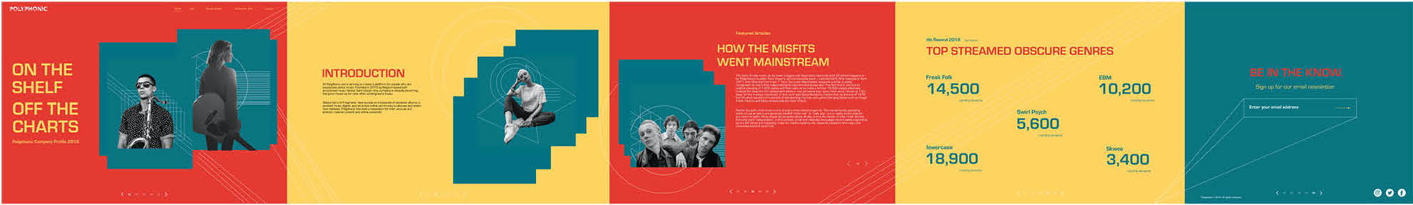
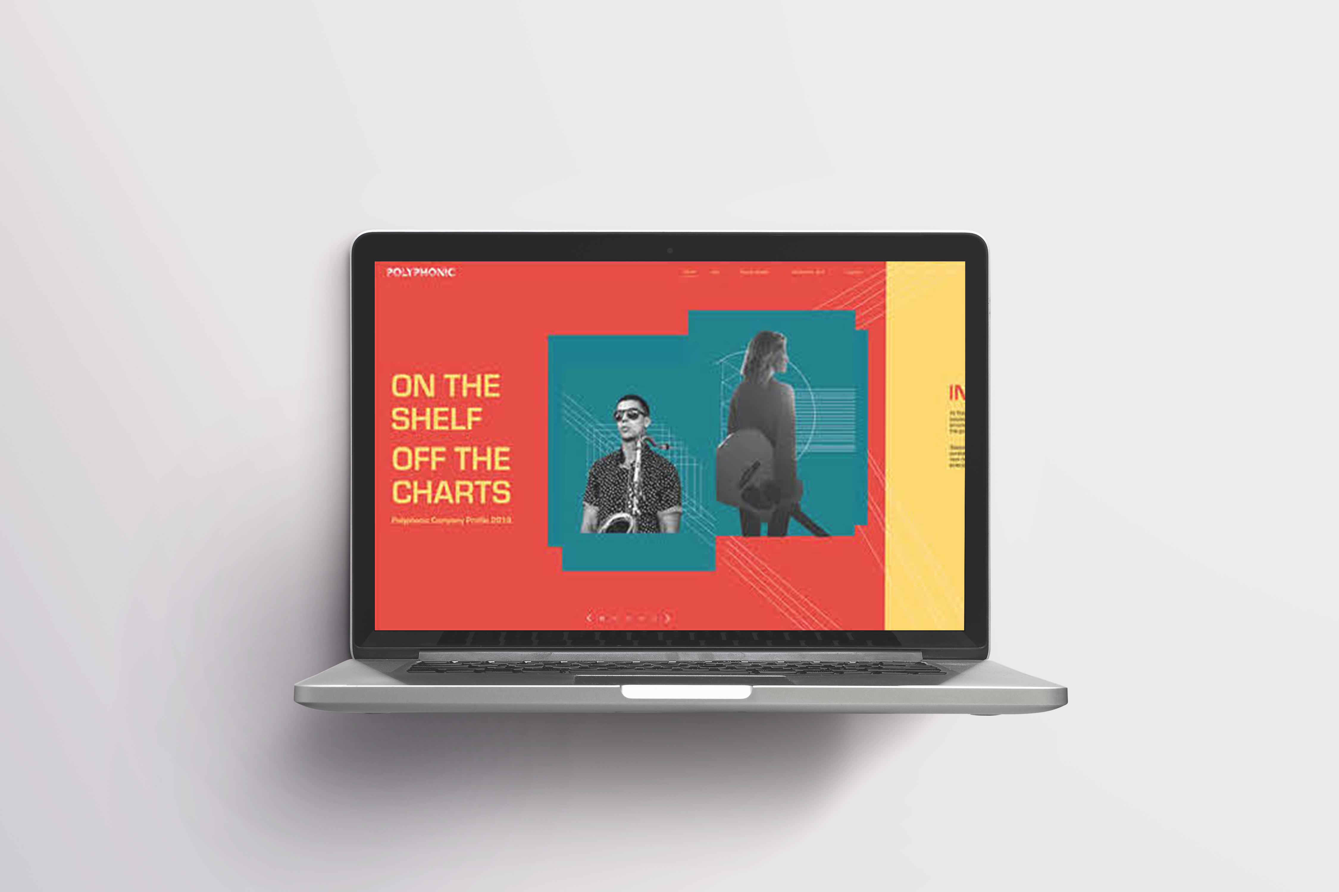
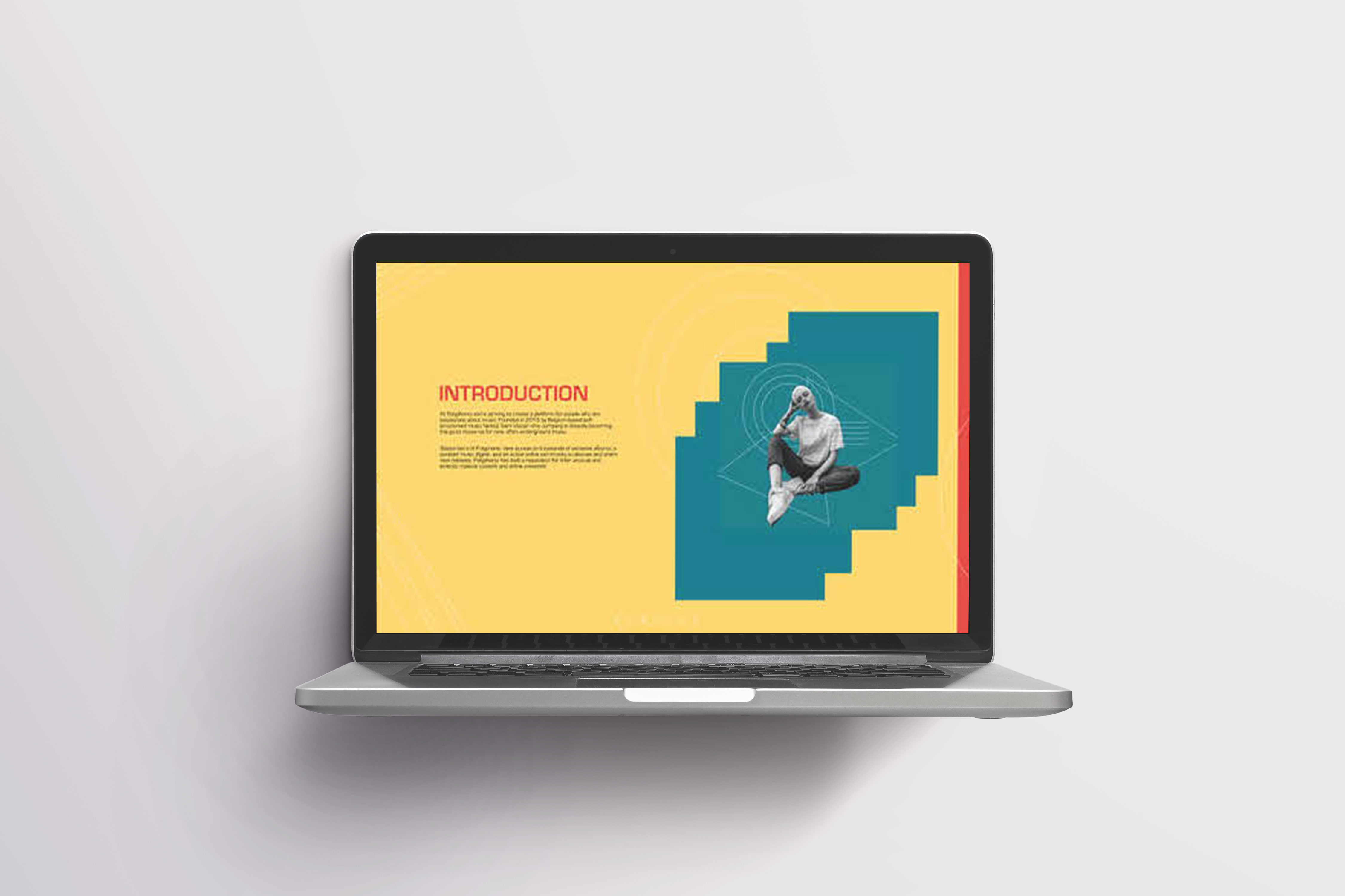
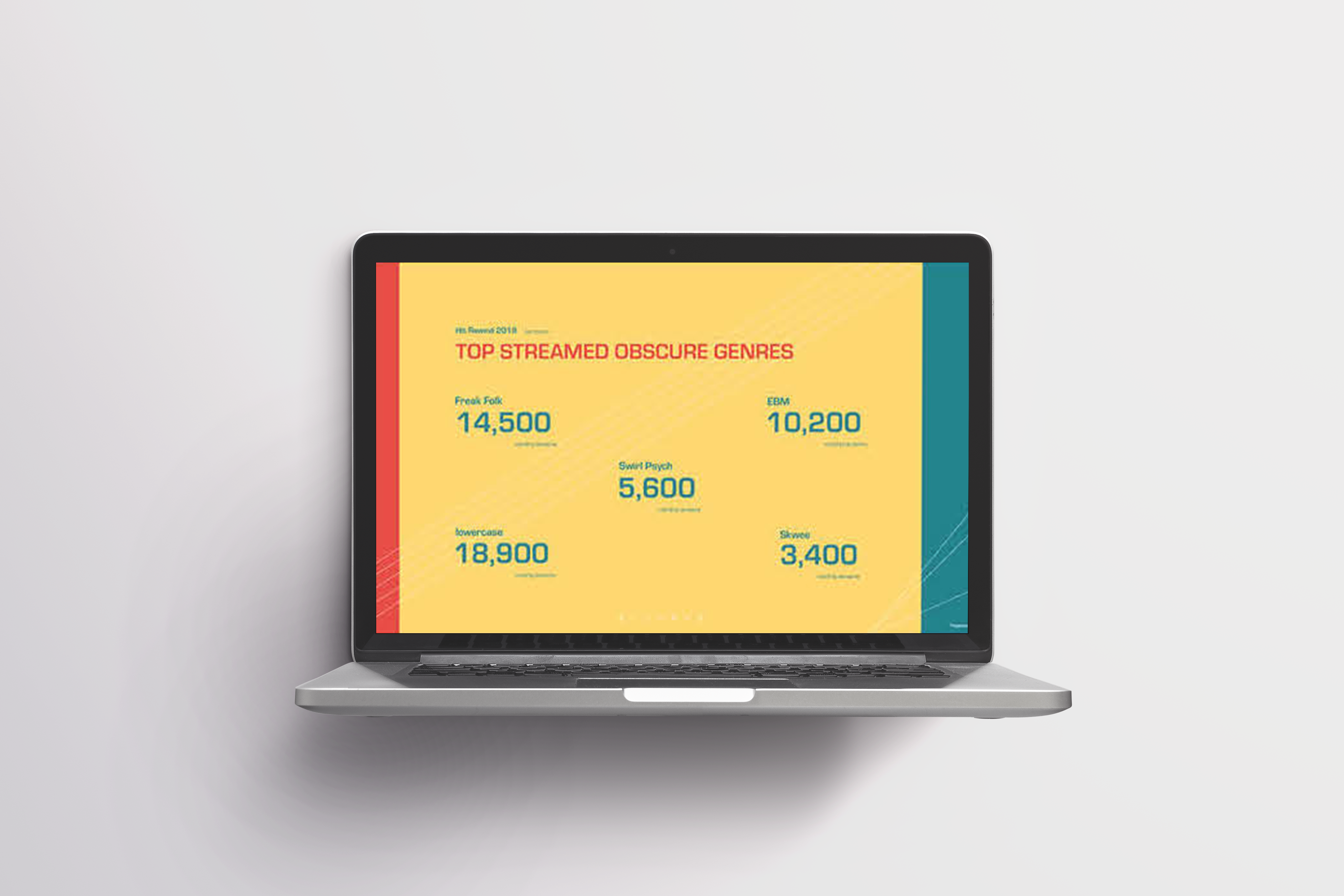
Polyphonic wants to create an annual report that highlights key themes from the underground music scene. The report will be avalible on their website. The intended audience is both subscribers and company investors. Polyphonic does not want a traditional annual report format, because they want the report to reflect their unique identity and off-beat taste.Key Features
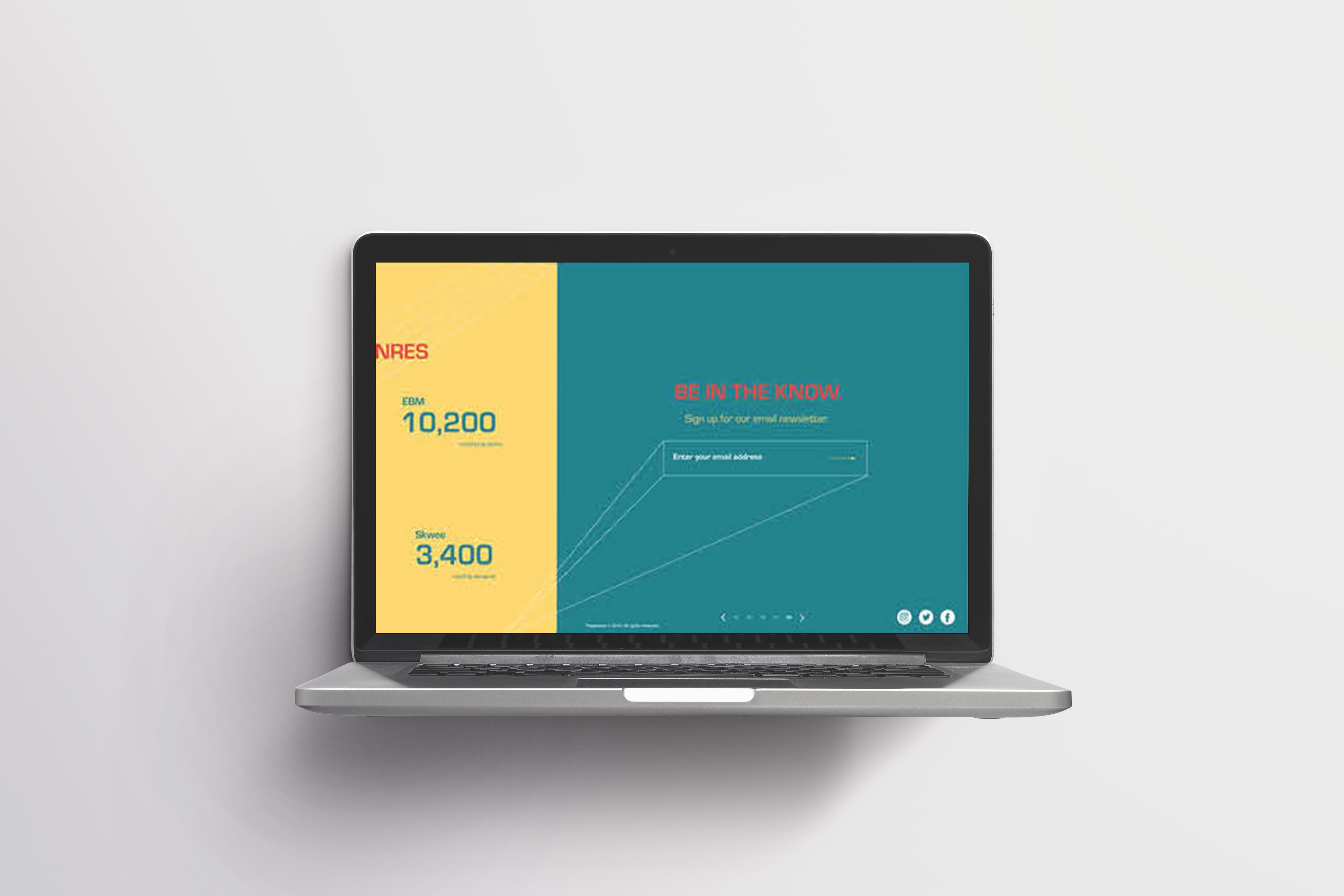
The client asked for:- a single-page dynamic micro site
3. typesetting
Brand Concept
“Light Up the Dark”Polyphonic is a platform for underground music. Through their annual report, the company sheds light on notable figures in the underground music community. I chose the brand concept “Light Up the Dark” because the report is intended to illuminate new music that is outside Pop culture.
Key Words
Untraditional, Idiosyncratic, DiverseI settled on these key words through my research, my understanding of the brief, and my knowlege of the client’s identity and mission.
Research
Polyphonic is a music community and source for underground music lovers. It streams over 1000 songs and only promotes artists that are lesser known. Polyphonic is distinguished by its active online community, its diverse tastes, and its quirky identity.In the music world, the term “polyphonic” means “many-voiced,” or multiple musical textures overlapping one another, as opposed to music with just one voice. In other words, polyphony is a type of musical texture consisting of two or more simultaneous lines of independent melody.
In my work, I wanted to root my design in this concept of simultaneous lines as independent elements that converge to create a dynamic whole.
My research probed my client’s business objectives and what Polyphonic stood for. I came up with the key words and the brand concept to help me ground my inital design ideas. Then, I sketched mock-ups for the annual report. I started with a black and white color scheme to make sure I had a strong layout, and ensure that text was easily digestible. Finally, I added visuals and color to give the report a unique presentation.
Full Horizontal Micro site